Introduction
In this brief, we are to explore and investigate the full extent of a cycle of a professional design brief within the context of proper and good industry practice. We are also to create a comprehensive design proposal which would include client needs, time constraints, costing, personal strengths and weaknesses and resources. To complete this brief, we would need to research, analyze, develop and execute our design solution in response to the brief and what the brief outlines. It will, in the interest of being as professional as possible, critically evaluate our own work and client feedback.
Explaining a project life cycle
So, a graphic design project will typically start life as being a brief, given by a client to a designer, that outlines what work needs doing. This will usually explain what needs to be done, by when, why the project is important, guidelines, format and target audience. This is all important information a designer will need to help them create something the client is happy with, whilst possibly highlighting the designers strengths, creating a project a designer can really sink their teeth into.
Next, the designer will then highlight initial ideas, this can be through mind mapping, listing and so on, but will soon develop their ideas by creating mood boards, preliminary sketches and so on, which will help them narrow relevant ideas down and casting aside ideas that perhaps do not best highlight whatever the brief outlines.
After this, the designer will typically evaluate and analyze their work by explaining what they like or dislike about it and critically considering whether it is best suits the brief.
After the development and analysis stage, it would be time further narrow ideas down and start creating work that considers all visual elements in relation to the brief and previous experimentation such as colours, format and guidelines given. It is a designers job to create something that can really push their creativity, whilst staying within the boundaries of what is given by the client.
Next, the designer will create final designs, with all the necessary formatting and so on in place, and present ideas to the client, usually with a proposal that highlights why certain design aspects were chosen in relation to things like guidelines, time constraints, resources and so on.
Finally, the work will then be utilized and released by the client, often supplementing client and consumer feedback back to the designer.
Research and initial ideas - Berlin wall
My initial ideas relating to the 'reinvention' of the Berlin wall, is to center my brief outcome to creating branding for a contemporary, fast-food company in Berlin, using influences and imagery from the Berlin wall era and using visuals that is inspired by that era such as graffiti, punk and the idea of 'breaking out'.
The big thing I would have to consider is how socially appropriate it is in todays Berlin. By this, what I mean is, whilst Berlin has always been a center of anything that goes against the grain, such as the punk movement, graffiti and so on, is it still a sore spot of contempt for modern Berliners to create a visual identity for a brand that profits, to some degree, over the cities past? This is something I would have to explore and explain as I write my proposal.
The Berlin wall was a guarded wall and barrier that lasted from 1961 to 1989, it contained and separated East and West Berlin, the East side was a communist puppet state propped up by the Soviets and the West side was a capitalist democracy propped up by the likes of the United States, United Kingdom and France.
It was eventually toppled by both sides of the wall as communism in Europe started crumbling and shifting, a major turning point for the cities residents who watched the wall prop up and shift at different points from guarded checkpoints, to an ugly grey wall decorated by locals trying to make less of an eyesore.


Research and initial ideas - Cartography
Another idea of mine, is to create branding for a bookshop, that utilizes the contexts and visual elements of old maps, it is a chance to create something with a sense of antiquity.
Another couple of things I would have to consider is the copywriting of old maps and how I would go about using them and the specific contexts of some older maps. What I mean by this, is some older maps may use imperial world knowledge of the time and I would have to be sure it is not too insensitive to use with a modern target audience.
Cartography is the study and practice of creating maps. It combines geographic data, visual aesthetics and scientific techniques to communicate information on land and sea masses (sometimes air) in an aesthetic and informative way.
Cartography, as a practice dates all the way back to ancient times and became a way for communities to effectively navigate what is around them, both geographically and politically, but it left a lot of guess work as to what was beyond the initial proximity, which is why some ancient maps are wildly inaccurate compared to now.
As time goes on, cartography is also used in architecture and urban design to navigate what can and cannot be built as well as a way to reflect political and social boundaries.


Research and initial ideas - barbershop
Another initial idea I had was to produce branding for gentleman's barbershop, it would be a barbershop with a rustic appeal, inspired by the old-style of barbershops of the past.
To do this, I would have to consider the style and stripped-back elegance of the old-style barbershops of the past, as well as consider what a barbershop really is, on the surface it is a place to get your haircut, but look beneath that, and you will see that historically it was also used as a gathering place for men (typically) and a place for exchanging ideas.
Barbershops date back as far as the Roman empire era, where early barbershops became hot beds for people to get their news and so on. Throughout the middle ages, many barbershops were also places to get surgeries. In the late 18th and 19th century, they were ore tailored to cutting and grooming hair and became a place for men to exchange ideas and socialize. In the modern era, barbershops are used to cut hair, groom beards and so on in a refreshing way, as well as a social area for people.


Summary of initial ideas
The one common denominator, in all of my initial possibilities, is branding. It seems, at this stage, that branding may be how I approach this brief, within whatever idea I do further research, explore and develop.
I like the idea of creating a visual identity because it means I can utilize design elements such as textures, typography and illustration to create something that both represents a brands ideas, products and values, as well as, what my strengths are within the graphic design industry.
I would essentially like to take something of the past, analyze it and develop a brand out of it but with a modern twist and with an attraction to a certain audience.
Subculture: Punk
Adjective: Home-grown
Problem to be solved: A celebration of Berlins art and music scene, as well changing the perception of the cities history.
Design proposal
My chosen idea to take further into the development and further research stages is 'The Wall' idea. I want to create something that is memorable and contextually relevant in terms of my research. It would also allow me to have fun within the project, focusing on typography, in particular, the decay of graffiti, subversion and visual identity which I firmly believe are becoming my strong points within graphic design. I believe this due to the overall positive feedback I got on previous briefs in which I used subversion and more practical methods of creation and I intend to do the same, but on a more specified scale, on this project.
I believe this idea can play out well because of the historic and meaningful relevance it has to the city of Berlin, whilst also maintaining a strong design influence to accurately create a brand out of. As for the city of Berlin itself, it is a place that has been the center of many historic moments, both good and bad, and yet is able to be one of the main areas in the world for art of all forms, literature, food and music, no matter how bad or good things get, Berlin finds a way and that is something I would like to reflect upon in this brief and find inspiring. That being said, I would not ignore the issues that have faced the city and find a respectable balance, I feel like, as a designer and creative, that is something that becomes my metaphorical duty to contextually and carefully approach the difficult social conversations.
The reason context is important for a brief like this, is because the Berlin Wall era of the city may be a sore spot of contention with some of the cities residents, as the older generation may remember the pain and division that era had caused and may take offence. To avoid this, I will research into what similar ideas are out there and how they were able to avoid offending or causing contention with the wider, general public. But, I do believe the idea is a strong one and can even help shed a light on to positive parts of the city of Berlin as I had mentioned previously.
Initially, I would research the city as mentioned, I would also research other restaurants in Berlin, what food they serve, how popular it is and who it is popular with. I would also like to research Berlin based artists such as 'KASE', 'TICK', Paul Klee and Gerard Richter. I would research into the local music scene, past and present, and possibly research into street photography within Berlin. I can perhaps utilize or manipulate Berlin street photography and tie it into my other, more expressive experimentation and use software such as Photoshop to overlay my own design experimentations and urban, edgy photography of the city and even look at previous examples that would feature the Berlin wall, although sourcing this may be difficult, I am sure I can find something either in books or online that has exactly what angle I am going for.
To do this, I would mind map initial ideas and time scheduling, followed by research into the history of the city, it's art scene, graffiti that wrapped it's way around the actual Berlin wall itself, music and typical street food cuisine. I would then start to define ideas with mood boards, which would specify my plans for fonts, colours, visual aesthetic and inspirations and then analyze and reflect on those aspects. Next, I would draw up basic logo concepts, with an analysis on why they work and evaluate why they may not work. After that, I would take primary inspirations by taking close up images of graffiti and urban decay in my local area and create sketches based on that and start to think how I would apply those ideas. I would then start the process of digitalizing my ideas, seeing what works on a screen and what does not and evaluating the why and the how. I, as a designer, love using practical methods in my work and I feel like this brief would allow me to explore that, so I would probably revisit some older production techniques such as printing and photocopy manipulation. After that, I would define the usage perimeters of what I have so far provided and create smaller details such as brand patterns to further help solidify my brands visual message. I would then start refining and narrowing down my ideas, analyzing and correlating the visuals I have created with the brands core values and mission in mind. After all of that, I would then get peer feedback on work and respond whilst evaluating my final work in relation to brief requirements and client needs.
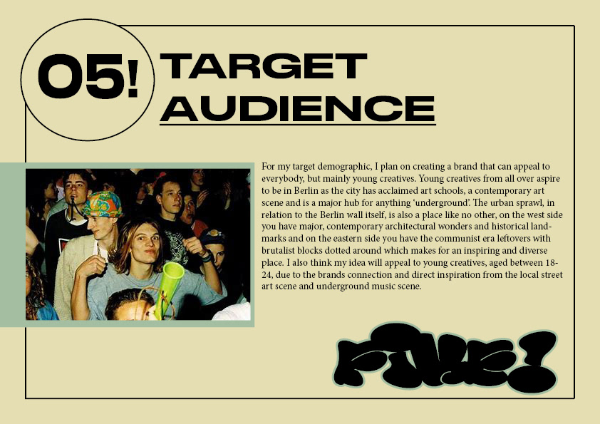
For my target demographic, I plan on creating a brand that can appeal to everybody, but mainly young creatives. Young creatives from all over aspire to be in Berlin as the city has acclaimed art schools, a contemporary art scene and is a major hub for anything 'underground'. The urban sprawl, in relation to the Berlin wall itself, is also a place like no other, on the west side you have major, contemporary architectural wonders and historical landmarks and on the eastern side you have the communist era leftovers with brutalist blocks dotted around which makes for an inspiring and diverse place. I also think my idea will appeal to young creatives, aged between 18-24, due to the brands connection and direct inspiration from the local street art scene and underground music scene.
I touched upon processes earlier, by briefly explaining that I want to revisit some of old favourites of mine such as photocopy manipulation, whilst this is true I also want to push the boundaries of that and intend to experiment that process with Photoshop texturing and creating my own textures and unique patterns with spray-paint. All in all, whilst I will analyze and explain as I go further into the development stages, I want to step away from the digital aspects of it a little bit and really push the boundaries of what I can do with visual identity on a more practical scale and so timing will have to be planned out well.
When it comes to timings, I will make a full schedule, detailing what it is I am getting done and when. But overall, I want the first couple of weeks to be research and and finding primary sources to utilize in said research, after that I want to really knuckle down and do as much as development I can for a week or so, which will hopefully give me some extra time to further explore ideas if needs be. Then, after that, I want to use those ideas in relation to branding and visual identity, testing layout and formatting options and narrow down those ideas from the development stage. I then want to fit in a peer and self reflection on my ideas and have time to respond. Towards the end, I want to finalize my designs and evaluate.
As for resources, the college provides a lot that I can use to produce high quality work, but there are specific things I want to use in my work, such as spray-paint, which I will have to provide for myself and that is fine due to having a lot of paint anyway and knowing how to get cheaper paint quite easily. I also recently provided for myself an Epson home photocopier which will allow me to manipulate my work much easier. Another thing to consider, is scrap resources I can either make or find cheaply to create my own textures and assets, which is something I have wanted to explore for a little while and this brief will hopefully allow me to tick that off as a designer and get some real-world practice within the design industry. As for cost and financing, I would like to reflect on the do-it-yourself attitude that street art has within my work and so that means keeping within a sensible pricing range and really learning what it means to break boundaries with resources that are more free at hand. With that being said however, I will also need to create and format my work with industry leading, professional software such as Photoshop and InDesign which can help me produce sleeker and finalized designs, which is crucial to learn anyway, but especially in the context of branding and visual identity from an industry stand point.
In conclusion, there is a lot of work to be done in this brief and with a more forgiving time to do it in, I am hoping to achieve something that accurately meets the standards of the brief requirements as well as experiment with some old and new techniques that will help portray my ideas in a visually appealing way whilst approaching the context of what I am doing in a well informed and culturally relevant manner.


Artist research and evaluation - 'TICK'
'TICK' is a graffiti writer from Berlin, who has been painting the city streets and subways since the 1990's. A fair amount of the writers old graffiti can still be seen, as a testament to his endurance.
Since then, the prolific, urban scrawler has also moved on to other ways of putting a name on a wall, he has experimented with sculpture mostly using metal, concrete and glass to create forms that resemble the name 'TICK' or 'TIK'.
'SUCKMYDICKMYNAMEISTICK' was a piece painted on a whole train around the year 2003, it was one of the most famous pieces of Berlin graffiti and for a good while supply shops and the like sold prints and photos of it or directly inspired by the piece. What is interesting to note, is that a lot of people in Berlin noticed that it was painted on a non-regional train, the GDR S-Bahn, with red and grey colours, class 485, an East German train, in 2002, most of them were painted in red and yellow instead, to unify the entire Berlin S-Bahn railway, so to see such history brandished with such a bold statement divided the Berlin public.

I like the writers output and work, I would like to incorporate the strong, bold lines and simpler colours the writer uses in his work, within my own experimentation. I also like how the writer uses both uppercase and lowercase lettering throughout his work, it creates a contrast to the larger letters that surround them, especially in the i's because not only are they painted slightly smaller, but also the dot on top contrasts the bolder, more squared lines of the other letters that squeeze it in.
Contextually, I believe it is important to note the train piece he did on an East German train. It had people divided because of the fact it is history, but it wasn't a good part of the cities history and many people were split from families, some were shot and killed for trying to cross, some were arrested and so on because of the erection of that wall. I think this can relate to how I approach this brief, create the outcome, but be careful that what I do does not necessarily attack history and instead embraces what has come of it as a result of the cities history.
Artist research and evaluation - 'KASE'
'KASE' was born and raised in the former East Berlin, right by the wall, and reportedly has memories of close family losing jobs and houses in the aftermath of the walls collapse. He said that he felt that all social norms and rules were stopped and suspended for a time, which led to chaos in the city but also a strange optimism and sense of adventure. In West Berlin, at the time, there were a lot of underground techno parties which the prolific writer would attend and that led to his first interaction with graffiti as an art form, rather than political hot takes from the past.
Since then, the writer continues to paint less urbanized spots from in and around Berlin, and instead focuses on creating more abstracted, detailed pieces in quiet areas with less hassle.
The influence that abstraction, and even cubism, one could argue, cannot be left unsaid, his work often plays with abstracted letter forms with a focus of detailing being on the blocky tones of colour throughout, it reminds me of Picasso, but instead of portraits, it is lettering.
I really like the forming of his lines and how the writer is able to capture different shades, giving all his letters depth and a three dimensional effect, every letter looks like it is carved from stone or ice, which could be interesting contrast the less detailed effects found in typical graffiti 'bombing'.
I also like the writers personal recollection of the Berlin Wall, and an Eastern perspective, which is never something we, in the west, really consider, it might be interesting to experiment with that perspective in mind.
Artist research and evaluation - Paul Klee
Paul Klee (1879-1940) was a Swiss/German visual artist whose work was directly influenced by movements such as surrealism, cubism and expressionism. Something that is unique, is unlike other expressionistic artists, he preferred to work away from his peers, exploring new art trends in his own way, which is what gives him a unique edge.
During the first World War, Klee was given a post as a reserve, and later, a committed soldier. During this time, he claimed that he had long had a war inside him and so outwardly, the war wasn't his concern, that was until friends of the artist started dying. He also restored camouflage on German warplanes which provided him the opportunity to paint more in his spare time and by 1917 he was claimed as one of the greatest of new German artists by critics in the art world at the time.
In later life, the artist, like many at the time, had work terrorized by the Nazi party and so, due to this, and illness, Klee left for Switzerland where he continued to create work that was expressionist in nature.


Above, to the left is a piece of Paul Klee's work, titled 'Tale a la Hoffman' (1921) which consists of watercolour, ink and pencil. I like the shapes that decorate the background space, you can see that they are toned down, due to being watercolours, which I really like because it allows the ink and pencil to stand out. The pencil and ink seem to show an abstracted, up for interpretation, staircase, with figures dotted throughout, and unspecified plant life. This painting was based on the Hoffman poetic tale 'The Golden Pot' a tale that switches from fantasy and normal life, which may explain the toned down colours, they're bright and fantastical, but toned down to show reality. As Germans are natural storytellers, it may be interesting to take inspiration from German fantasy tales within my work, or at least reflect some of that mythical essence through colour and lines, such as what Paul Klee seems to have done here.
Above, to the right, is a piece of Paul Klee's work, titled 'Blumenmythos' (1918) which consists of many materials such as pastels, fabric, board and newsprint. I like the use multiple tones of what seems to be the same colour, I also enjoy how the white elements of the artwork contrast those deep reds. The birds in the work could represent warplanes he saw whilst in active service, which creates a strange juxtaposition with the feminine form of the landscape. This could also explain the deep reds that we see, in my opinion, due to menstrual cycles and their connection to nature or because of the fact that red is often seen as the colour of anger and this could be the artist conflicted and adjusting to normal life and relationships compared to the war seen before, bare in mind, this was painted in 1918. I think it could be interesting to take colour and try to associate with the cities history, which is very complex and sensitive, in some parts.
Artist research and evaluation - Gerhard Richter
Gerhard Richter (born 1932) is a German visual artist who has strangely done both, produce abstract works and photorealistic paintings, his work is often seen as some of the best in contemporary German art history.
Rather depressingly, he became conscripted into the Hitler youth as a child, after two uncles died in the second World War and an aunt, who was schizophrenic, was starved to death during the Nazis euthanasia program. This lead to some artworks being created that focused on family members who were both members and victims of the Nazi party, reflecting and revealing a very complex and upsetting family history, which probably reflected the reality of a lot of Germans post second World War.
After that, the artist focused primarily on abstraction, creating works for many different conceptual angles and themes, exalting spontaneous, random mark-making with a level of spatial logic.


Above, on the left, is artwork titled 'Zwei Frauen' (1967) it depicts two women, sat down as if they are in mid-conversation. The painting takes aspects of realistic forms and an abstracted perspective, which creates a strange contrast, as if you were in a dream, it seems, like Klee, there is a cross between what is real and what is fantastical, which I find really interesting.
Above, on the right, is artwork titled 'Abstraktes Bild' (1990), what is interesting is that all the abstract pieces, from around this time at least, all have the same consistent name, which gives a sense of uniformity, despite the unique brushstrokes and intimate patterns created within the abstract works. This was to leave more for interpretation, letting ideas come to piece, rather than expressing ideas on to the piece of artwork. Again, it is about exploring abstraction, and I really like the look of the work on the right because it almost looks like it was painted on a wall, with all the grainy textures and hard brush strokes.
Restaurant research and evaluation - White Trash Fast Food
White Trash Fast Food is a fast food company located in Berlin, it was founded way back but has since become a bar and music venue as well. The earlier branding consisted of punk-like approach to graphic design, I like this brand due to it's strange combination of influences, Chinese food and punk rock. The graphics also take a physical, practical approach as the lead designer, Paul Snowden, would scour the internet looking for punk and hardcore records and adapting the imagery to the brand and restaurant.
Below, is a scan-in of a page that showcases some of the earlier graphics work, in punk like fashion, a lot of it is black and white and looks quite collaged and do-it-yourself, which is an approach, I really like this idea and I want to explore this in my own work and development of ideas.
Next to it, on the right, is contemporary branding for the company, it looks a bit cleaned up but still stays true it's roots with overlayed texture and distressed typography. If I had to guess what this restaurants brand values would be, I would say is frugality and attitude.
A fun thing to note is the menu was created and depicted to resemble a punk/hardcore fan magazine.


Restaurant research and evaluation - The Pub
The Pub in Berlin, is a restaurant that is clearly inspired by British pub culture but with a gentrified twist of offering catering needs and reservations.
The branding uses downplayed colours, which are further reflected in the dim interiors which creates atmosphere and mood.
Judging by a brief look at their branding and website, the branding is quite plain but has a classical appeal which plays to the British pub culture aesthetic.
I really like the brands simplicity and sleekness, it is able to show you what the brand is about without it being in your face.


Idea development - logo
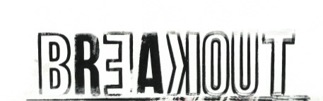
Below, are some sketches for possible logo ideas for my brand. My brand will be called either 'The Wall' or 'Breakout', it is all down to experimentation and seeing which of them work the best.
I want something that is clear and readable, this is due to initial plans for quite an oversaturated and detailed branding pattern. So, with that in mind, I want eliminate the logo choices that are visually 'too much'.
I want to experiment with practical outcomes further on in the development stages, I want to step away from the computer a little bit throughout this brief in general and so experimenting with print, may be the way to go.


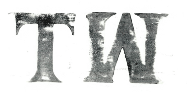
Logo development and woodblock printing
Below, are some logo ideas and typeface ideas, taken from above. I wanted something that was clear to read whilst being grungy and so using the word 'Breakout' was an associative word for representing the Berlin Wall and having it staggered such as that below, meant to resemble the wall breaking.
Using woodblock printing as a method was fun because it meant doing something more practical within my work and it also means that natural distressing can occur after pulling the paper from the print.


Mood board - further idea development
This is a mood board which highlights the kind of direction I want to take my idea in. I want a food truck that looks visually appealing and 'edgy' as such, it also highlights the sort of typography that I would like to explore and develop in my own way as I go through with this project. Also highlighted, is some of the colours I would like to experiment with, but it has to be said, with the street art/graffiti angle, this is subject to change as the final design developments maybe more or less colourful.
You can see above, where I have experimented with physical wood prints, that I think could develop a unique logo and even be used for things such as menu headers.

Primary source inspiration - local graffiti
I could not go to the city of Berlin itself unfortunately, but, I was able to get some close up pictures of graffiti that is local to me. I did this to get an insight into the shapes, lines and colours that are typically used in the art form. I think this would help me develop a visual link into my branding by creating imagery that resembles this, the crisp, bold and often straight lines is something that I could use to create a specific, unique and niche visual identity for my brand.
I could apply this to creating a visual identity through digital illustration, for a clean, crisp look, but, as I stated, I want to step away a bit from the digital side of things and instead think more practically. I could apply this idea through sketches, prints and general experimentation.


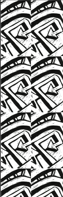
Idea generation - Linocut printing
Linocut printing is a method of printing where you would carve into a piece of linoleum, coat in ink and then run through a press for a unique and often clean print. Below, is a process and evolution of a sketch I made inspired by the unique shapes and lines of graffiti, from paper to Lino to print.
Overall, I think the process and execution went well, I want the clean print that Lino cutting provides, but with a rough texture to the image and so quick cutting, with all the narrow lines and grooves, helped me to achieve this.
I wanted the rough texture on the print because I think it could prove to provide extra detail when developing from this idea. For example, I could zoom in and out of the design, like I did with the images of my primary source inspiration. I also think the texture reflects the grimy, urban nature of graffiti but also celebrates it, which can make a consumer question what is deemed positive or negative about any particular situation they are in.
I could develop this further by using something else that is practical, such as spray paint or ink, to create something even more visually interesting to look at when zoomed in or out and also further reflect urban decay, whilst celebrating the diversity of the art scene in the area.


Further idea development
Below, are two experiments that utilize the patterns that resemble graffiti through the lino cutting technique. On the left side, I used the logo intertwined with the design to create a bold, black and white image using exposure on Photoshop. I wanted something that looks 'punk' but also ties in closely to the urban art scene of the area, crossing two different, but somewhat similar, subcultures together, this could be utilized for packaging and so on. On the right side, is a brand repeating pattern using the design which could be used on the margins of promotional material and so on.
Moving on, I want to experiment with the idea of using colour and seeing how the designs I have made so far visually respond to that, this could help me pinpoint what colours could work when it comes to the specifics of the branding and can further ingrain that idea of promoting positivity within the city and celebrating the art and music scene. I would likely do this using spray paint as the colours are bold and abstraction is made easier, it also ties into the graffiti and punk ideas I have for the brand.

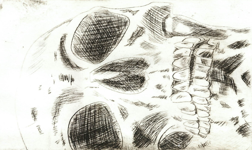
Idea development - Dry point etching and printing
Below, is a dry point etching print of a close up profile of a skull. I think this matches the aesthetic of punk that I am also trying to approach and appeal to and that is further indicated by the etched method and nature of dry point.
I could further develop this by creating promotional material in relation to the brand such as an advertisement that highlights what the brand sells and covertly celebrates the brands core value of celebrating local art and music in the area and subculture I want to market towards.

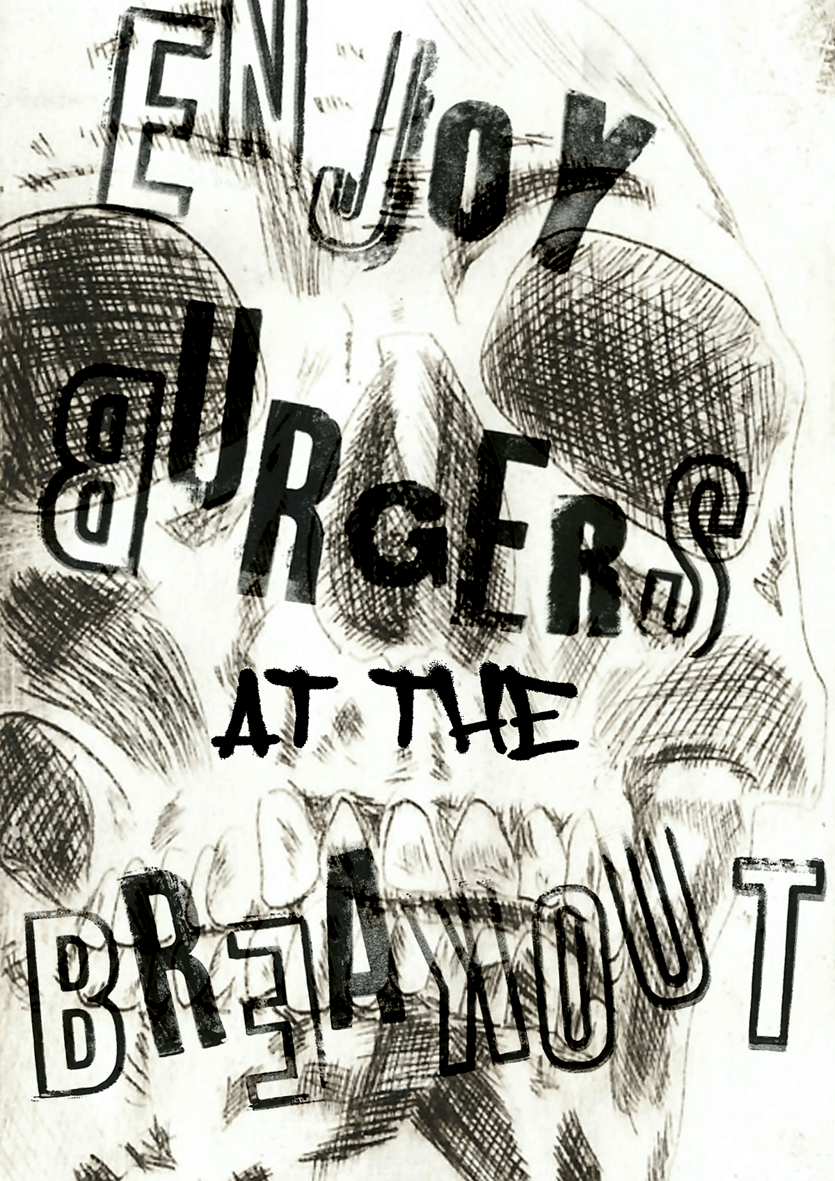
Further idea development
Below are posters, made in a 'paste up' style, that could be utilized for promotional materials and, as per the brand values, can be blasted around Berlin and create a real home grown feeling to the restaurant. Another factor that could support this home grown feeling, is the physical, practical, do-it-yourself approach that the poster designs have, they are made with practical elements such as print and etching and applied in a physical way, through pasting up, in the urban landscape. I feel like whilst the marketing and promotion is unorthodox, given the influences of graffiti and street culture, that is kind of the point and is subversive and can create a grass roots, 'for the people' business in the city.

Semiotics and brand identity
Semiotics is the study of signs and how they communicate to us visually and is often used in branding a lot to help define an identity and set of values for a brand to communicate to a consumer. With that in mind then, whilst I have touched upon what my brand is and what it's influences are, I feel it is best to really look deeper into how I want to communicate that to a customer.
As previously mentioned, the brand is for a food truck that serves things like burgers and hot dogs, with a German twist, such as Bratwurst hot dogs and Hamburg inspired burgers. It goes into more than that though, the branding is to be a positive celebration of the city of Berlin and the branding is to reflect that by taking inspiration from the urban art scene and punk scene and infusing them together to create something everyone can enjoy. This whole idea stems from inspiration from the Berlin Wall, a wall that stood as testament to Europe and the world post war and into the cold war era. With that in mind, I used the name 'Breakout' as reference to that and it also sounds quite edgy and punk-like, and since the wall was covered in graffiti from disgruntled citizens on either side, I felt it was only fair that it gets the recognition it deserves, as from that, the urban art and music scene in Berlin exploded.
I want the branding to reflect the core values of the brand such as being homegrown, determined and for the people.
So I want to use patterns and materials in the branding that are unconventional but are a sign of those values, such as spray paint and physical imperfections.
As for the branding itself, I will create a brand guidelines that help determine what can and cannot be done with it and why.
Brand pattern experimentation and development
Below, are experiments on brand patterning, brand patterns are important because they can visually link certain lines and colours with the brand. In this instance, I used acrylic based spray paint to create quite a unique and abstract set of patterns to develop with. I did this because it acts as a primary source of inspiration, from my research, and links it to those underground art and music movements that I wanted to celebrate within my branding.
I used the brand 'Loop' because it is a common brand used by graffiti writers across the globe, especially within Europe and is versatile because of it's lightweight and low rattle.
With the development, I just want to see how it could work with the logo and how it could fit into things like menu and leaflet development when I go into the editorial stages of process, below is some loose templates based on that idea.
I also felt it was important to utilize this abstraction with what I already have, which is the logo, combined with strong lines and a grungy, angry style and seeing how the respond with each other. On the left, I really like because it adds just a flicker of colour without it being too distracting or completely abstracting the design as a whole, it looks like it could be scribbled on a wall or an old piece of graffiti that is found in an urban landscape.


Type sheet development and analysis
Below, are some type sheets I created with a license free, chosen fonts that I think reflects the brands need for the unconventional and practical with a mix of the urban spark that is needed in a competitive field. I think the font has a certain appeal, but can also be legible and recognizable to any customers, past or present. I like the complexity it creates as well, there is a heavy depth to it and if the letters were closer, they could look like abstracted patterns within themselves, which is something to consider when moving forward, but I almost like that about it, it is a complex look used in a simple manner, just to read text, which matches with the brands conceptual side of being more urbanized and homegrown, which then matches the core values.
To the right of that, are some other type considerations, I went with a more punchy-based appeal, something grungy and more plain. This font is not an approach I want to take further, but it could be modified towards something else in the development process perhaps.


Menu Development
Below, is a design proposed for the menu, due to some constraints with my laptop recently, I have had to 'make do' with what I have at hand, it is quite frustrating but it could be a crucial lesson in saving progression and problem solving.
The menu is a simple sheet, with a back design that is more extravagant and holds more relation to the graffiti/punk subcultural crossover that I am trying to market towards, whilst the back is a little simpler, highlighting what food and drinks there are. The food on the menu, is simple, like many fast food trucks, but with a German/European twist to typical fast food, offering items such as Currywursts and smoked bacon pasta.
You can see the logo which is loud and bold on the design, on both sides. This is because the logo itself is able to be manipulated for different layouts (explained further in brand guidelines) this allows for more versatility in creating brand materials.
Whilst being limited with my laptop acting up, this has lead me to rely heavily on practical, analogue methods of creating, in the interior of the menu, I have used hand printed type for the menu and logo and used a threshold filter on my spray paint texture to further perpetuate the subculture I am trying to appeal to, whilst making sure the distressed look is still there.

